This is a long overdue post mortem of NYC-Dems my participatory visualization of New York City resident endorsements in the 2013 Democratic primary. As stated in the visualization's about section the idea was born from my experience as a political organizer for Barak Obama's general election campaign in 2008 and for the Oregon Democratic party prior to that.
The visualization was conceptualized and coded in a few days a week before the primary. You could call it a one man hackathon. With the primary just a week away a friend asked me who I was voting for and I realized I knew very little about the candidates and that neither my friends nor the media I consume were talking about the election. Being a developer I thought the best thing I could do was code up a medium to spark discussion.
My goal was to create a space on the web for the types of conversations I had going door-to-door speaking to voters as a political organizer. I also hoped to learn a bit more about the candidates, as well as about my neighbors and my fellow New Yorkers. It felt great to ship in app in just a few days of work, and while I would have loved to see more participation, I consider it a small success to get a few thousand visits. And the map made it to the top of r/nyc which felt good as a redditor.
Participation
The primary was held on Sept 10, 2013. My map went up five days prior on the fifth. In the following week I saw 1,810 unique visitors, 2,123 visits, 2,603 page views, and 140 endorsements.
Naively, I was surprised to witness a classic web conundrum that a small percentage of visitors actually contribute to user generated content on the web. Only 7.7% of unique visitors created an endorsement. A few people told me they were uncomfortable sharing a political opinion publicly online identifiable by address. Despite understanding the concern there are a few reasons I hoped that would not be a big disincentive:
- I had a hunch location-centric discussions could tell us a lot about this election and would have popular appeal
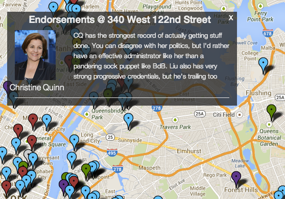
- New York City residents generally live in apartment buildings so addresses are not very helpful in identifying a specific voter
- People do this in real life speaking with campaign organizers anyway
My participation statistics were on par with what I've seen on average on the web so I don't think asking for addresses was a catastrophic deterrent. That said, for participatory work on the web to go viral you have to beat the averages by a few orders of magnitude so any serious deterrent is something to avoid in future work when optimizing for user participation.
Design
The design challenge was to create an aesthetic complimentary to Google maps. While it is also possible to customize Google maps I simply did not have time to go that route. I focused on creating a minimal, flat, uncluttered look. For mobile devices I used device width queries to clear the screen of non-essential elements.
The appearance of the markers on the map was a major decision. My plan was to use a large marker to make the map feel more full than it actually was and then switch to smaller markers as the map filled. Unfortunately I never reached an endorsement density where it felt necessary to switch to the smaller markers.
One thing I would do differently next time is add a button to de-emphasize or hide markers where a user did not provide additional comments with his or her endorsement. Right now the worst part of the user experience is clicking on a marker to find an endorsement and often not getting any more information than was provided by the colored marker because there are no comments. This was actually recommended by a member of the Hacks/Hackers email list who worked on the Google Maps team.
Technical Details
NYC-Dems is a web application built with Rails, but the bulk of the codebase is front end code written in Coffeescript. I would describe it as a "not-quite-Single-page-app." NYC-Dems comes close to being a single page app, but instead of handling all of my routing with Javascript I defined two routes in Rails, one index route to show the entire map and one show route that zooms in on an individual endorsement.
You could ask why did I handle routes this way when I still have to handle differences in the two pages on the front end anyway. The answer at the time was that this would let me ship faster. The other options would be to either introduce a front end framework like Ember or Backbone or Angular that handles routing or handing routing by URLs myself using the HTML Pushstate API. If I were to return to this codebase and improve it I would definitely switch to handling URLs with the Pushstate API. It's not much more code than allowing Rails to do the work for me and it makes more sense in the context of the codebase. The front end code is doing the real work and the backend is providing an API. I betray that by defining the extra route in Rails.
When I was coding the visualization I was in a rush to get everything done ASAP, routing via Rails instead of going 100% single page app was a way I cut corners to ship in a sleep deprived, caffeinated rush.
Another thing I would do differently is steer clear of the Postgis extension for Postgres. Postgis allows you to add a complex geolocation object database column, which is amazing but far more functionality than I needed. All I needed was to store a latitude and longitude for each building in the database. In fact I had to rewrite this functionality to remove Postgis anyway because I was paying $50/month to host an app with a database extension, an unreasonable cost to keep a side project online for demo/portfolio purposes.
Conclusion
Shipping the app was a great experience and I look forward to working on more visualizations in the future. There's nothing like shiping to teach you how to create better work next time.
Also big thanks to my friends Hallie McNeill and Eli Dvorkin for their feedback on my work in progress.